
PLUCKY
Plucky | All-In-One Pet Adoption
Uniting the right people with
the right animal in need
What
Plucky is a platform that provides an easy and enjoyable pet adoption experience for both prospective adopters and shelters and rescue groups.
Time
10 weeks - parallel with other projects.
Who
Me! This is a solo project, so I was taking on multiple roles.
UX Research, Interviews, Testing, Wireframing & Prototypes, UI and branding.
Device
Android
Tools
Sketch, Figma, Invision, Principle, Adobe Suite, Slack, G-Suite, TeamGnatt
The Problem
With the global success of the #AdoptDon’tShop campaign, pet adoption naturally became a trend. However, according to Humane Society Canada, around 20% of rescue animals are still left unadopted, which equates to 22,000 lives!
This signifies that there is a mismatch in supply and demand between how many people want to adopt animals and how many animals are still left unadopted in the shelters.
Plucky is designed around one question:
How might we
improve pet adoption experience for prospective adopters in order to help more animals in need by matching the right people to the right pet?
The Solution
Plucky tackles the pain points and desires of real users uncovered by research and interviews. The flow and features decisions are backed by usability testings and further research. All in all, Plucky is designed around true human- centered experience.
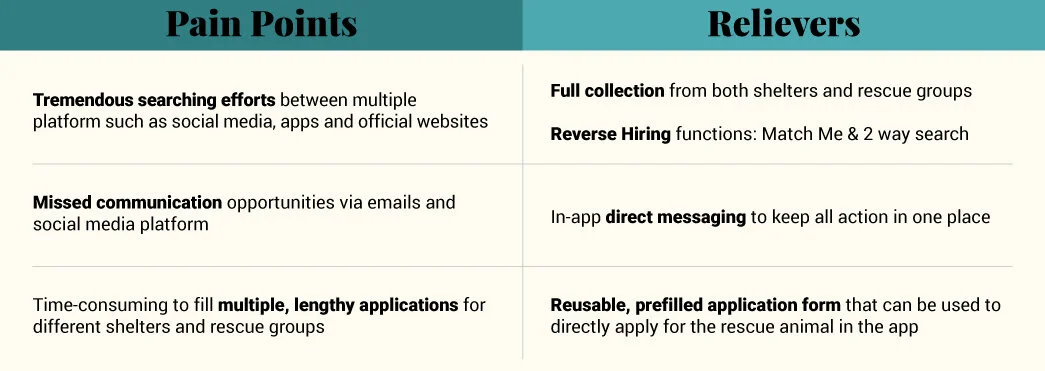
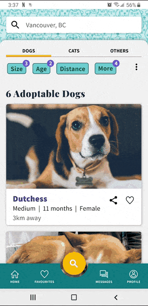
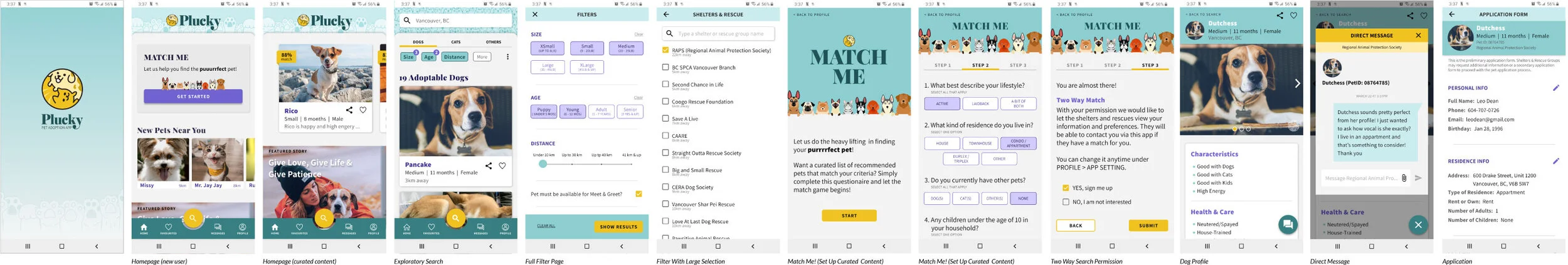
Exploratory Search
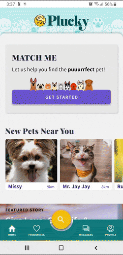
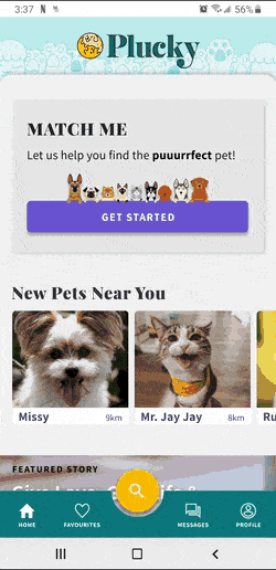
Match Me! 2 Way Search
In-App Direct Messaging
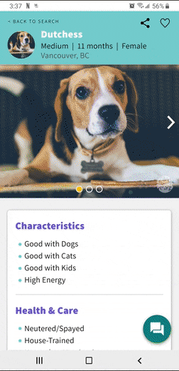
In-App Application
Try the Plucky App
The Process
RESEARCH
Target Audience
Plucky targets all animal lovers seeking to help animals in need. However, our main target audience is working professionals who are of legal age and are able to handle the finance and responsibility involved in providing care for an animal. They also have the hardest time getting the application approval compared to other demographics.
Market Research
Before diving in, I looked into a few apps and websites that currently exist in the market

Research
A project brief and proto-persona were made to align the project’s intent and outcome; it also helped with the direction of secondary research. Some insights from the secondary research aligned with some of my original assumptions:
Unreasonably lengthy application forms
Poor communications between user and agency
Difficulty of finding local dogs
In addition, from an interview with the Regional Animal Protection Society (RAPS), they expressed that dog adoption is harder than other animals; Hence, I am focusing the project development on dogs first.

“… dogs were generally trickier to find the right adopters because they require more attention and care compared to other types of house pets.” - RAPS
Interviews
To gain insights from real potential users, I’ve set up a research plan and interviewed 6 people who had attempted or successfully adopted a rescue dog. Even though people had a good idea about how shelters and rescue groups operated, they were still easily deterred by factors such as:
search efforts
poor communication
waiting time
feeling of rejection
I also set up a survey for quantitative data and the result with 18 responses:
30% adopted a rescue animal from a shelter/rescue group
About 50% have tried but was rejected or given up
Over 50% searched on 3 ore more channels
Most popular channels are official website and Facebook groups
Which channels have you looked?
Where is your pet from?
Have you tried adoption?
Number of channels tried?
Persona
Backed by research and user insights, I created Leo, the primary persona, who’s a young working professional determined to adopt a dog to enjoy the outdoors with. Some of his pain points includes:
Extremely time consuming to search different websites, apps and social media for adoptable dogs
Feeling of uncertainty and rejection from lack of response or communication
Filling in too many lengthy applications for different shelters and rescue groups
Leo’s Journey
To understand how Leo may have moved through the landscape of pet adoption, an experience map, user stories, and a taskflow diagram were made.
Experience Map
Leo’s enthusiasm starts dropping when he have to sift through multiple platforms
His frustration grew with filling in lengthy application for a meet & greet
He’s at the lowest point when he impatiently waited for 1.5 week for no responses
User Stories
Search Epic: Inspired filters types, favourites, statuses & reverse hiring
Being Informed Epic: Inspired shelters/rescue information sections
Communications Epic: Inspired direct messaging & in-app application
Taskflow Diagram
Covered steps and functions involved with the main Search epic
Determined the main filter types for narrowing search results
Other related functions like favourites, applications, direct message & shelter/rescue group info
The Creation
PROTOTYPING
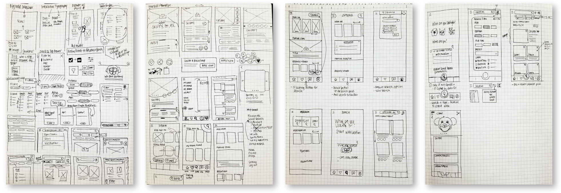
Inspiration & Ideation
It’s time to ideate! I started with a more in-depth look at more competitor apps and other apps with search and filter functions. Then it was time to put pen to paper, sketching out inspirations of ideas and components. Along with a working title, Soteria, I was ready to build the first version of the prototype using Figma.
Blocker
I was having a lot of blockers in terms of laying ALL the numerous functions that could be included.
To help solve this, I created a service design blueprint to gain an overview perspective of the app first. Then, taking the highest value “slice” into development
Usability Testing
A total of 3 low to mid-fidelity prototypes were made and the first two versions were tested with 5 participants performing various tasks illustrated in the service design blueprint. The insights from each round of usability testing were implemented into the next version of the prototype based on importance, impact and time.
Round 1 Usability Testing
(V1 to V2 Prototype)
Search function was not obvious enough
Would be nice to save search parameters
Tailor List card was overpowering search function
Tailor List page was confusing
Round 2 Usability Testing
(V2 to V3 Prototype)
Search function is not utilized enough
Confusion and cluttering to display both saved search and filter bubbles
Steps to creating a saved search is confusing
Poor association between top picks and match me
Prototypes Progression
My prototypes were built using Figma. V1 to V3 are low to med-fi greyscale with minimal use of accent colour. V4 is an Hi-Fi version with further consideration for accessibility in colours, font-sizes and spacing for mobile app.
Click on each image for enlarged view
Explore each version of my prototypes. The original working title was Soteria, which is then changed to Plucky in V4.
DESIGN
Branding
The branding identity and feel were the first things to tackle so that the interface design would hold true to its brand.
Through a collection of images conveying the feel of the brand in my moodboard, the brand colours were decided.

I wanted this app to be fun and lively, so the app was also renamed from Soteria to Plucky! In definition, plucky means to have determined courage in the face of difficulties.
Combined with inspirations of my moodboard, the typography, wordmark, and logo are made up to complete the branding.

App Design
The application of fun bright colours into an interface was proven challenging; especially with the right level of contrast and accessibility, it was fighting against an image-heavy layout. After getting feedback with peers, the original bright yellow & pink palette was then changed to the current teal/yellow/purple combination.

UI Library
The UI library, Paw Print, was created from the high-fidelity design of Plucky. It includes a collection of all assets used including different states.

Multi-Platform
Once the android mobile version is created, the next step would be to develop Plucky for other platforms - starting with the tablet.

Marketing
To help promote Plucky, a marketing website was created - responsive structure for both desktop and mobile viewing. The site was intended to have two versions - one for prospective adopters and one for shelters and rescue groups. Currently only the prospective adopter side was built due to time constraints.

THE CONCLUSION
Challenges
Staying Focused
Throughout the whole process of product design, I found that it was really easy to lose track! Mainly, it was having a multitude of people providing feedback and suggestions or getting sucked into “shiny” things - irrelevant gimmicks of aesthetics over function. It was important to take a quick moment to evaluate and ensure I was still designing for real people and around my how might questions.
Often and Early
At the beginning of this journey, I was not comfortable showing peers and other people of what I’ve done in the fear of not presenting quality work. However, I had soon to find that it was actually more helpful to ask for feedback and carry out tests with real people early and often! Asking for feedback and evaluating them along the journey was crucial to ensure I was working out blockers and potential issues sooner rather than later. UX Design is a process and it’s never finished, there will always be room for improvement and iterations.
Overreaching
As the research and design process went on, it was becoming more and more apparent that my project scope grew exponentially. I was overwhelmed. especially planning the initial tasks and flow of the prototype, knowing that I wouldn’t have enough time to map out all the tasks. I brought it up with my peers for advice and suggestions, then decided to narrow the interaction down to just a “slice” instead of the whole pie. I learned the importance of editing and evaluating to ensure success.
“Done is better than perfect” - Brad MacDonald
Macro vs Micro Thinking
Prototyping should be pretty rapid, but I was having a very slow progression at the beginning of the wireframe prototype design. Then I realized that I was trying to plan out the micro/details of the component while trying to ensure that they would align the macro aspect of the entire app. I took a step back, moved away from the wireframe design and took some time to create a service design blueprint instead. It gave me a really good overview of all the parties, platforms, and interactions involved - clearing the macro view of my project to help me design the micro parts of it all. This was a valuable insight into understanding how my thought process works
Next Steps
Research
Having connections to a shelter and a few rescue groups, I would love to conduct more interviews to gain their point of view on what they would like to see in Plucky for them.
UI
I would love to take some to add more micro animation to the product to increase interaction engagement.
Concept
With more time, I would love to develop the other side for shelters and rescue groups. I truly believe they are just as important in the success of Plucky as much as the end-users.
When the adoption side is developed for both prospective adopters and shelters/rescue group, the next step would be to investigate adding a rehoming feature also.