
Realtor.ca
Heuristic Evaluation & Redesign
Prelude
WHAT
My partner and I were given the task to redesign an existing digital product with a heuristic evaluation. We’ve chosen Realtor.ca, which is a property listing application, owned and operated by the Canadian Real Estate Association, with property listings available for sale or for rent.
WHO
June Fu
Prototyping, Evaluation, Individual UI Library Compilation
Holly Gilbank
Copy, Evaluation, Individual UI Library Compilation
WHEN
2 weeks
DEVICE
iOS
TOOLS
Adobe XD & Illustrator
Taskflow
We focused on the screens that a user would interact with while trying to search and purchase a new property.
Search Taskflow (Click to Enlarge)
Evaluation Summary

After conducting an evaluation of the 10 heuristics, there were two main heuristics that presented a recurring pattern on the majority of screens - #4 Consistency & Standards & #8 Aesthetics & Minimalism.
Other heuristics were also recognized, but they scored a lower severity rating overall and deemed a lower priority.
We gave Realtor.ca an overall usability rating of 3. While the current user interface is functional, there are definitely improvement opportunities to make the app easier to use for users!
Other Considers But Lower Priority Heuristics
#1 Visibility of system status
#3 User control and freedom
#6 Recognition rather than recall
#4 Consistency and Standards
Design, colors, and elements used across pages
Human Interface guideline and standard
#8 Aesthetics and minimalism
Heavy on information and repetition
Swayed the ease of navigation and use
Redesign
Before starting the redesign, I investigated the layout, typography, and colors used in the current design to ensure the original branding is honored as much as possible.
VERSION 1
The first version of the redesign was done with my teammate according to our heuristic evaluation.


VERSION 2
Version 2 mainly focused on accessibility with the contrast between colors and typography - ensuring that all texts were easily legible and enough contrast between colors for different sections. Additional CTA design and states were added for better variation.
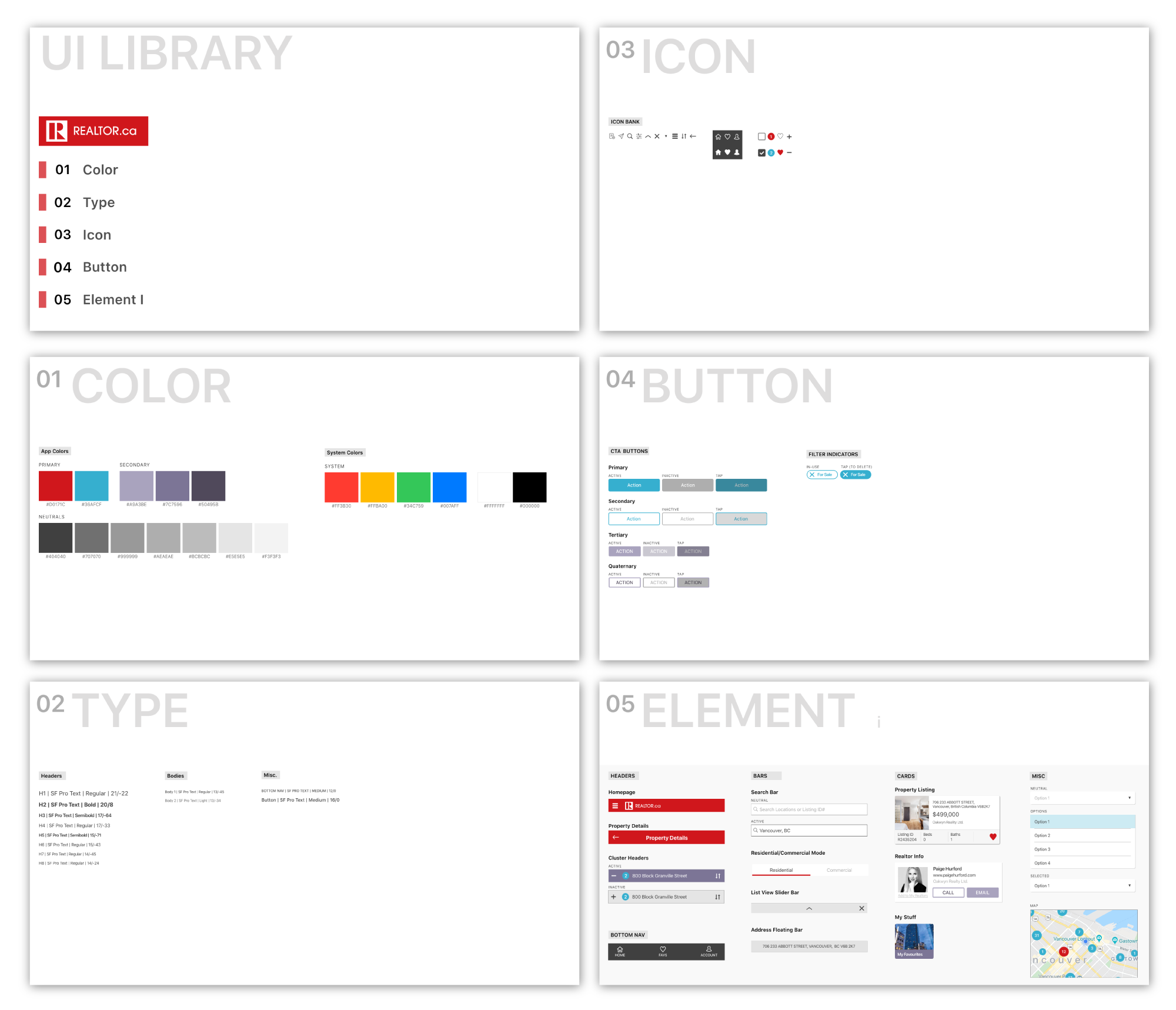
UI LIBRARY
After the second version of the redesign was done, I collected and organized the components, colors, and typography used in a UI library. Different states for icons and CTA’s were also included. It was good practice to get in the habit of compiling a UI library for better hand-off and revisions.
CHALLENGES
Understanding and applying the 10 heuristics
Applying accessibility consideration effortlessly
Considering different states for CTA & Icons
NEXT STEPS
Complete redesign on the remainder screens
Usability Testing on revisions
Continual building of UI Library